Branding is the art of infusing the defined personality, values, and offerings of a business into its representational visuals, communications, and overall experience. It creates a unique identity for a product or service in the minds of consumers, and, over time, builds a unique perception, promise, and relationship. Essentially, branding is about creating a connection with your audience, making a lasting impression and fostering loyalty.
True North Charities has been around for only a few years, but with the tremendous momentum of our work, as well as some key new partnerships, we felt like it was a smart time to evaluate the existing branding and see if it could take us where we needed to go. We brought in decade-long industry veteran Summer Teal Simpson Hitch to consult with us on brand, communications, and messaging strategy. Summer has worked with numerous big-league digital design agencies, including Ramotion, Unfold, and Focus Lab. She has worked with notable clients such as Shopify, Marketo, InVision, Weebly, Fodor’s, SpotHero, Outreach and SafePal.
Early into her process, Summer uncovered a set of challenges that led her to recommend a full organizational renaming and rebranding.
- The name True North lacked ownability, given the oversaturation of the brand name within the nonprofit sector, and beyond.
- The naming descriptor “Charities” was inaccurate to the nature of the work that we were undertaking.
- There was a significant opportunity to improve scalability and storytelling through our logo and logomark.
- Our brand visuals seemed to complement an earlier brand mission and did not account for a significant pivot in our work.
- The website was overly simplistic and lacked content and credibility.
- We needed a brand that could be used to visually represent our partnership with various strategic partners.
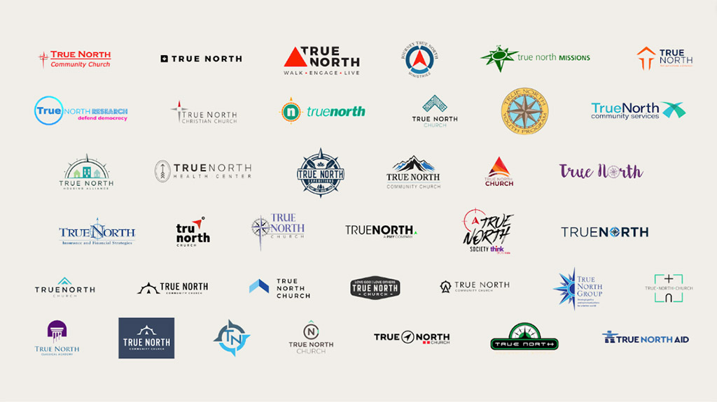
A quick brand equity analysis revealed little objection to a full rebrand, given that most of the brand awareness to date was retained in our people, not our brand. Summer then set to work to articulate some key defining elements of the organization to carry forth in the rebrand.
- We are a part of the communities we serve.—Our extensive experience in mission work, coupled with the presence of our full-time, on-the-ground Executive Director, has fostered our deep awareness and unwavering commitment to sense of place. We prioritize cultural sensitivity in all our endeavors, aiming not only to understand but also to deeply respect and honor the communities we serve. We view ourselves as learners, recognizing the value of exchanging knowledge while building trusted and esteemed relationships over time within these communities.
- We gauge success through lasting impact, not merely individual acts of service.—We are called to serve God in distant corners of the earth, and we fulfill this calling with unwavering dedication to His people. As we share and deliver God’s word within the communities we serve, we also strive to address the challenges they face with compassion and diligence. Our aim is not only to provide immediate assistance but also to foster long-term, sustainable capacity building alongside our local partners.
- We are trusted partners to our donors and donor churches.—We prioritize transparency and accountability in managing the funds entrusted to us. Leveraging our expertise and strategic insights, we are dedicated to ensuring that every dollar contributes effectively to mission work of the highest quality. Our commitment is to responsibly maximize the impact of each donation, enhancing its value in service to those in need.
In order to convey those defining elements, Summer recommended:
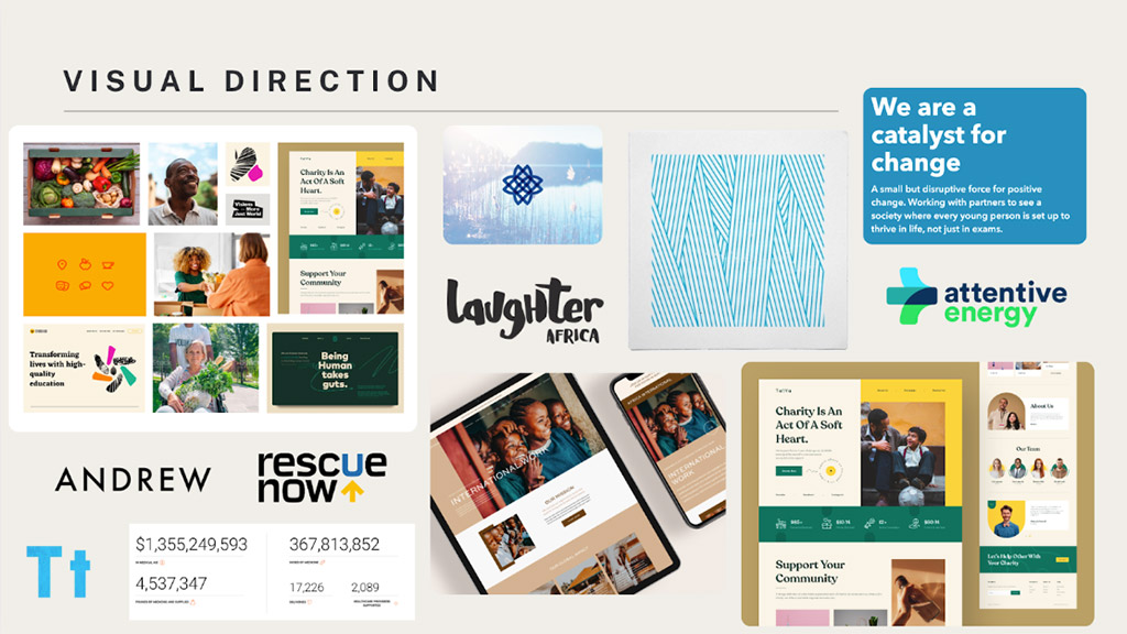
- A brand system that carried forth the vibrance of the people we serve, and the colorful nature of the cultures where we work.
- Handwritten or hand drawn components to the brand, given the humanness they convey.
- Overlapping patterns to convey a sense of working together.
- A sentence-cased logo that felt approachable but professional, and in a thicker weight to garner a sense of confidence.
- That photography and messaging would carry a great deal of emphasis for the emotional, spiritual, and values-led elements of the organization. In working alongside us, Summer felt the warmth, the energy, and the dedication of our team to our work, and as such she insisted this brand lead with joy in all elements photographical and textual.
Here was the visual direction board that she assembled to help convey some of those considerations to the brand designer upon hand-off.
But before the brand design could commence, True North needed a new name. Summer cautioned that renaming a brand is the single hardest part of her job. Because naming is such an emotional experience for those who have ascribed tremendous value to the existing name. She reminded us to consider that Kleenex and Sharpie were meaningless words when they were first introduced as company names; and Apple was simply the name of a piece of fruit. She reminded our team that the name was simply a vessel for us to ascribe values to, over time, and asked for an open-minded audience while she presented her ideas for the path forward.
Summer strongly recommended a naming approach of either suggestive real words, or descriptive compound words. And she gave us a solid matrix for vetting naming suggestions.
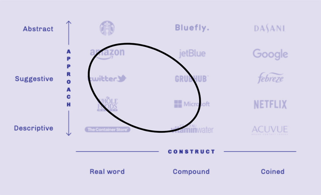
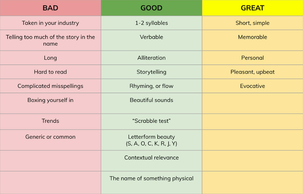
In order to better understand naming conventions in the humanitarian space, Summer broke down naming approaches across the religious-secular and NGO-GO spectrum. She spent time brainstorming and ideating around particularly relevant cues.
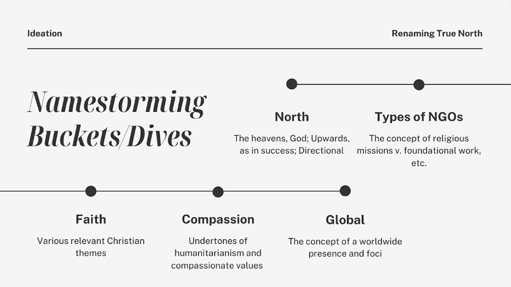
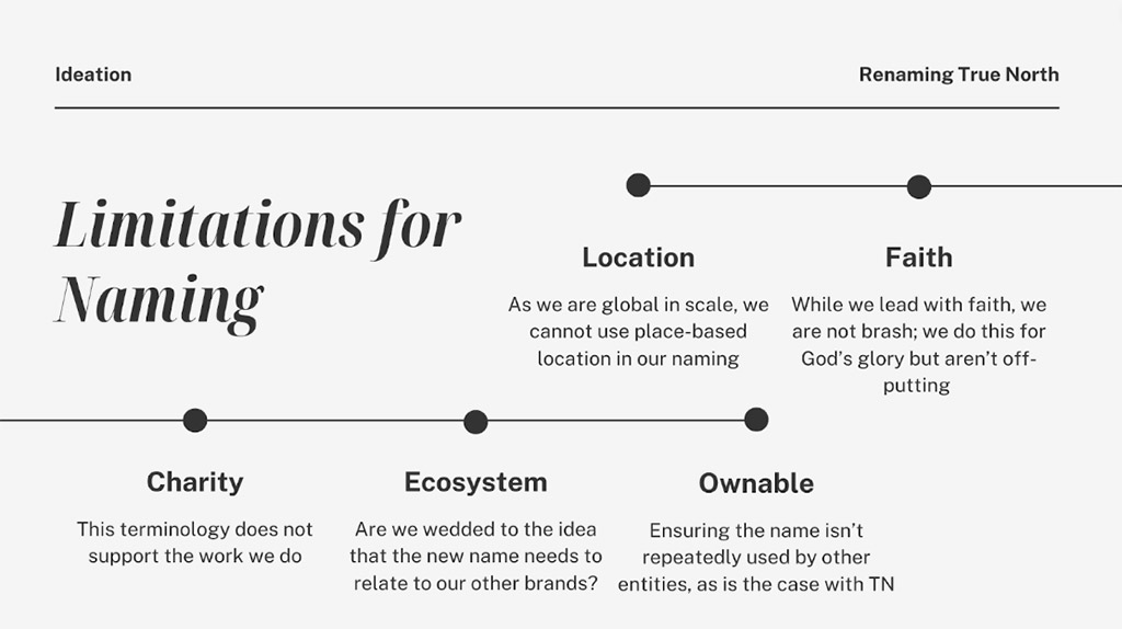
With some back-and-forth between her recommendations and internal feedback from our team, we all enthusiastically embraced the new name—Northbound Foundation—for the following reasons:
- Harkening the brand ecosystem of which it is a part (Northpoint, True North, etc.)
- Presenting a gentle nod to the brand equity from the name it originated with
- Conveying the sense of purpose under the organizational “North Star”
- Subtly conveys a sense of upward mobility and betterment, like a rising tide lifts all boats
- Feeling optimistic, upbeat, and promising
- Embracing a qualifier (“foundation”) that aptly conveys the nature of our myriad approaches to humanitarian work
To design the brand, Summer brought in one of the very best, former colleague Chase Turberville. Chase is a veteran designer who has worked at numerous highly-respected agencies like BFG and Focus Lab, and watershed corporation Time Inc. Chase springboarded from Summer’s strategy into a rich, exhaustive design round and produced numerous enviable directions for the brand identity.
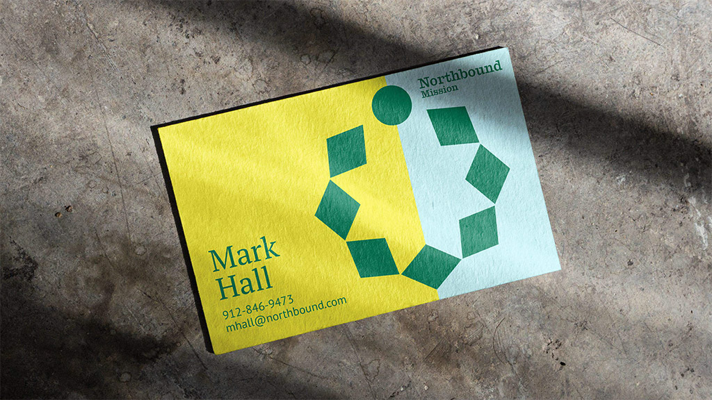
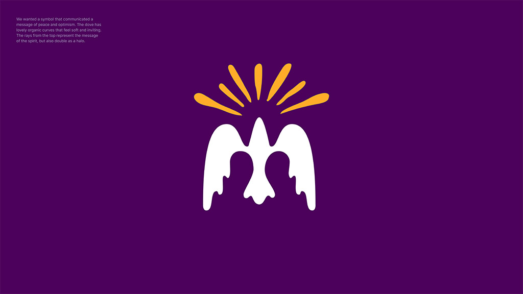
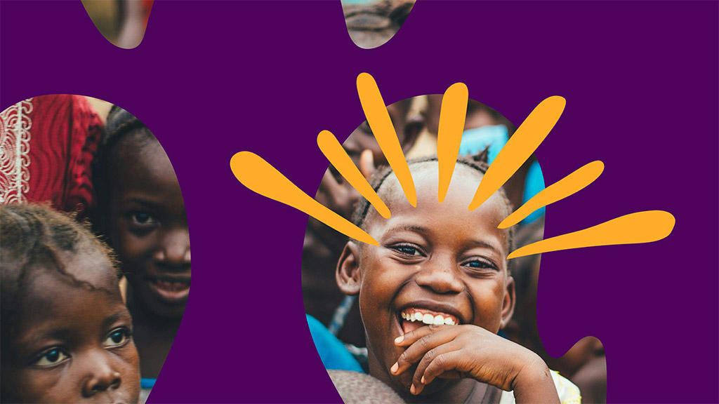
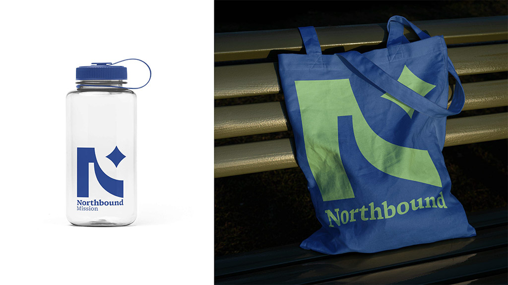
Despite four solid directions to select from, the frontrunner (and what would become our new brand) was always the direction called Ripple. Which Chase defined as follows, This direction symbolizes the expansive impact of Northbound’s work, illustrating how each act of kindness and service radiates inward and outward, creating waves of positive change. The logo, the Ripple, illustrates this effect in a very fluid and organic form that is both static and dynamic, at once. It also serves as the brilliant basis of an energetic pattern, and a vessel through which to highlight photography and individuals.


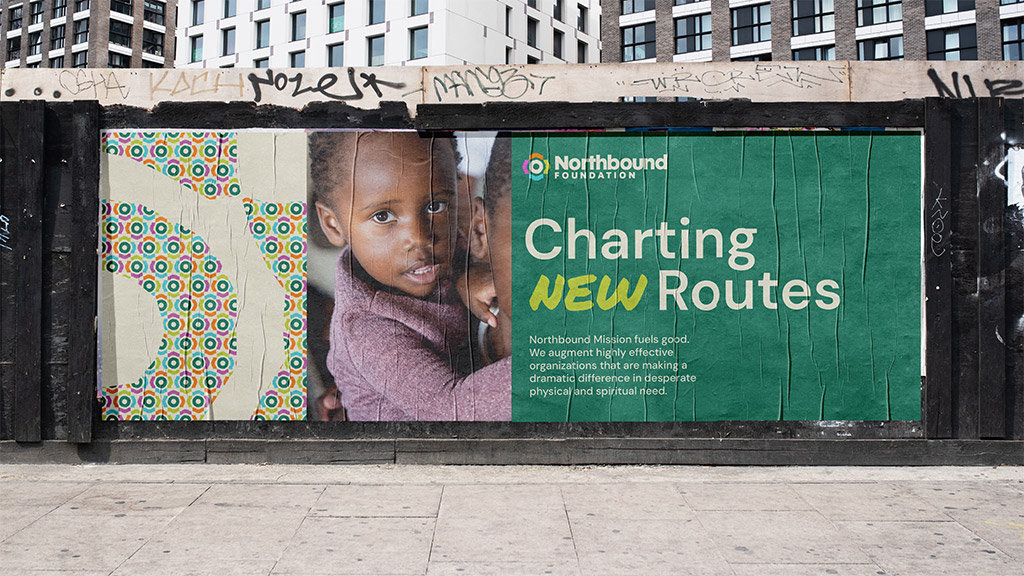

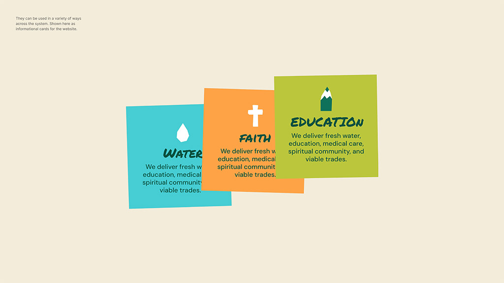
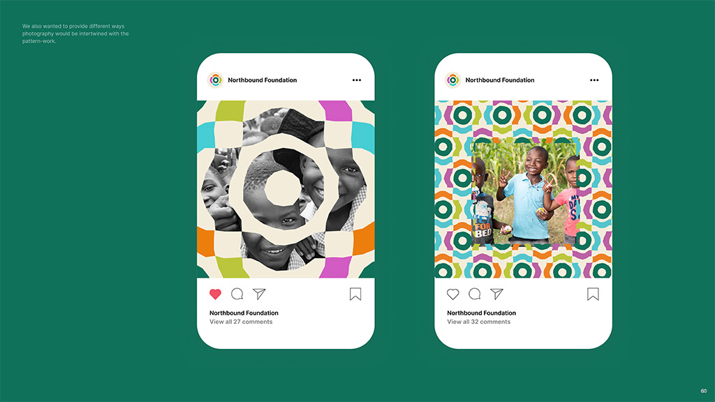
His designs beautifully captured:
- Leading with joy
- A sense of localism, or nativism in our work, through colorful, bold and vibrant patterns
- Patterns that embody working together
- Handwritten sub-header type and hand drawn elements that convey a very real sense of humanness
- A color palette that felt appropriately joyful, infinitely applicable, and relevantly professional
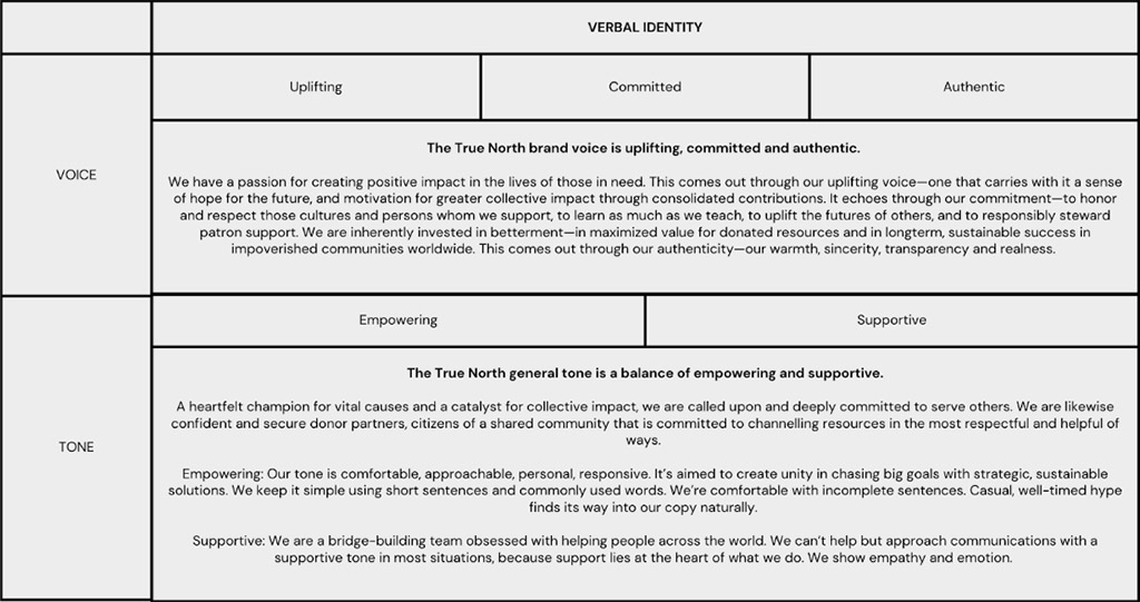
At this point we graciously accepted the branding assets and guidelines from Chase and passed them along to Heyo, the web design and development agency that we worked with on the new website. We had, meanwhile, been working with Summer to further define our brand communications and key brand messaging. This would be a vital step toward building out a website’s worth of copy.
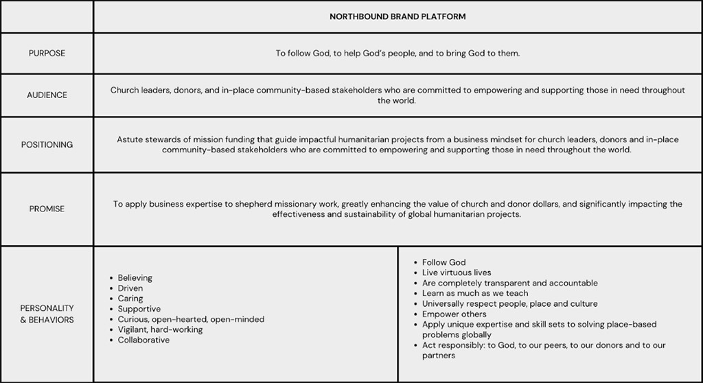
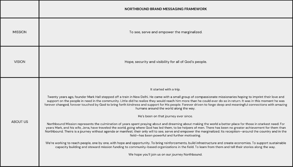
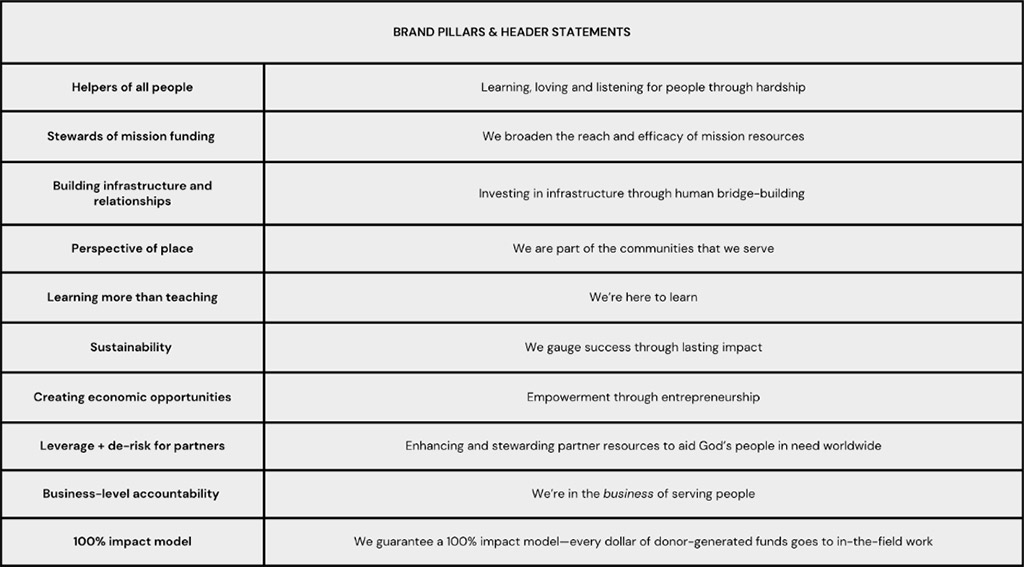
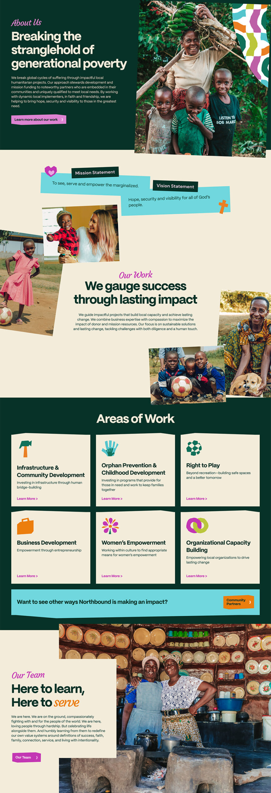
Since we had a clear vision for the site, the design process began swiftly and strongly. Wireframes (which are basic layouts of your website) were created to visualize the structure and content—much of which had been completed by Summer—with help from rounds of organizational-level strategic planning around our key areas of focus and growth. Once we had actionable wireframes, the designers developed visual mockups that brought our brand and website to life. This was crazy exciting. So much work was culminating in this moment.
From there, we moved into web development, where your website takes shape. The Heyo agency built the website’s functionality, ensuring it works seamlessly across different devices. This included everything from the visual elements to the backend systems that power the site. The new site is responsive across various devices, features a blog for updates from the field, highlights both our Development Partners and Community Partners, features in-depth looks at our projects, and has the capability to collect donations and grow our newsletter and prayer campaign lists.
But wait, there’s more. Because all the while we’ve been working on our branding, communications, messaging, and website, we knew that we likewise needed to bring change to our social media presence. With significant help from local photographers and videographers in the field, Katie and Josey, we were able to begin photodocumenting our work. That authentic, custom photography and videography—with the help of an experienced social media manager—has enabled us to create a much more strategic, emotive, and honest depiction of our mission, our work, and our partners through our social channels. We’re thrilled to finally have the best assets to help us tell our stories to the world.
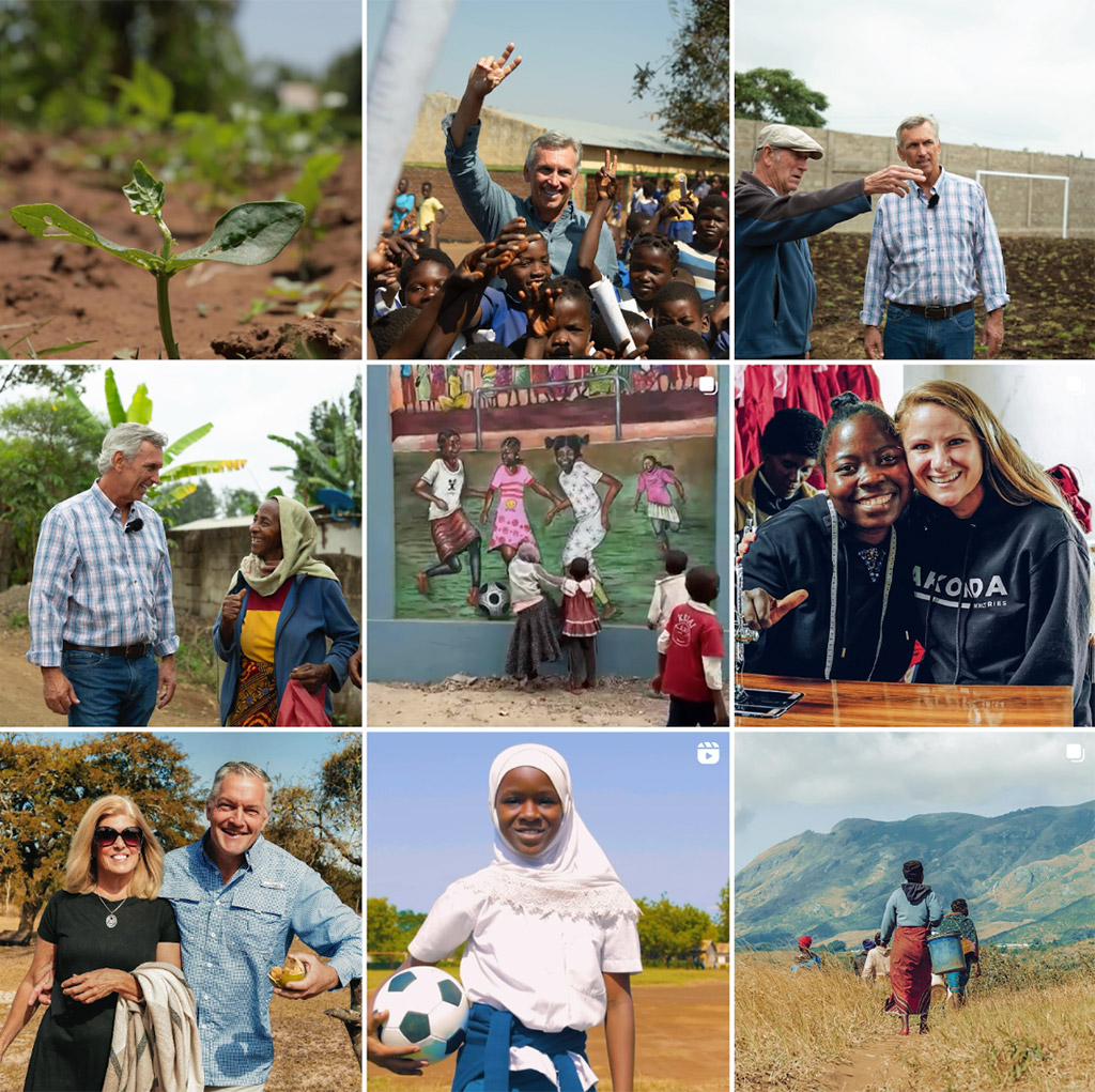
We’re humbled and excited to unveil our new brand, and our tremendous energy and determination for the path ahead of us. Thank you for sharing in our journey and believing in our work. Please follow us on social media so you can keep current on our ongoing efforts to bring hope, security and visibility to all of God’s people.
